Toor
Client
Project type
year
Project Overview
From March 2022 to September 2022, as a part of my Professional UX Design Certification from Google, I design a user centered experience that is tailored to couples looking to
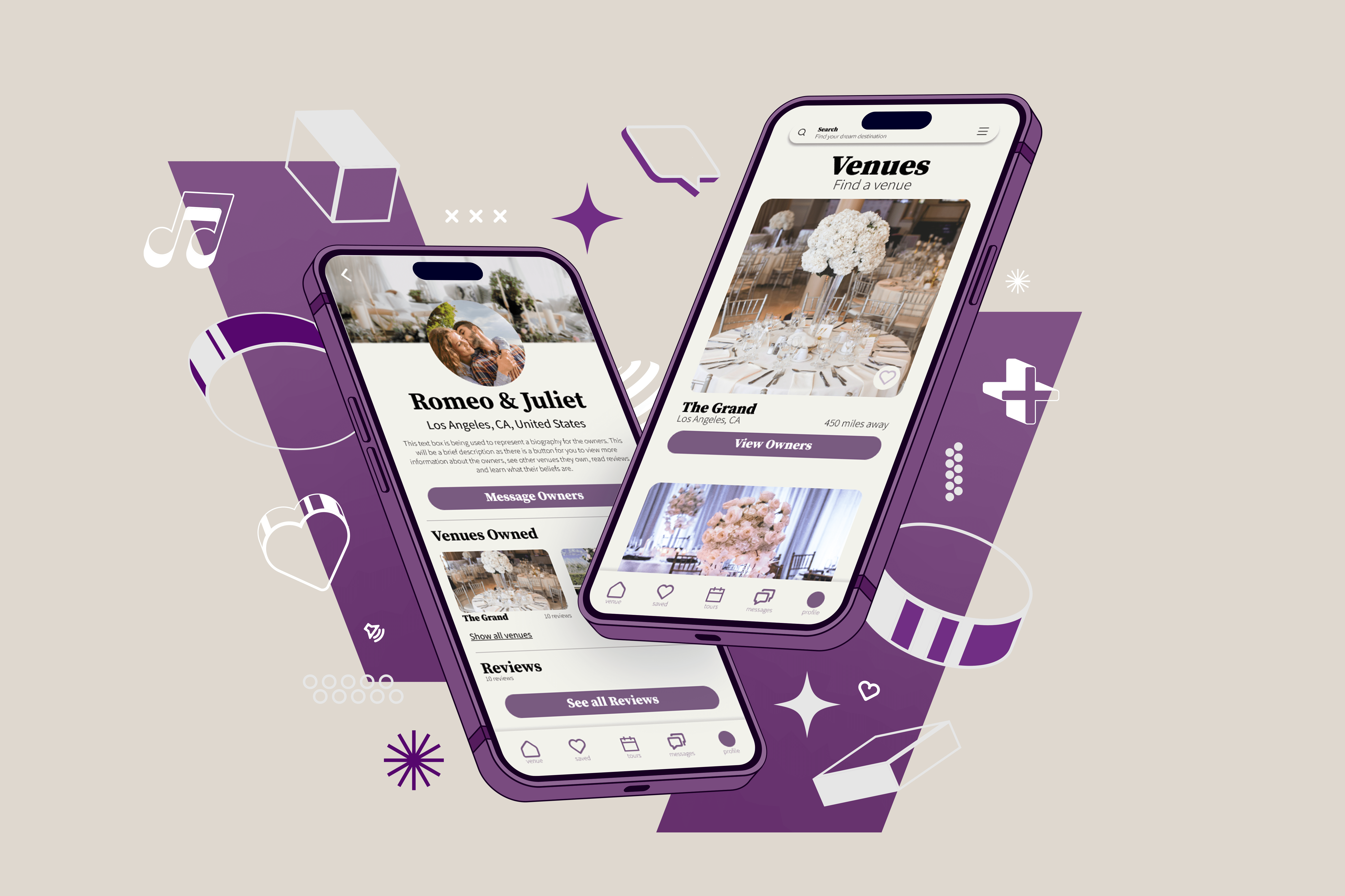
Toor is a mobile application that connects people who are searching for a specific location to have a wedding and/or event to the people who own that venue. This platform allows users to find a dream destination without having to worry about physically traveling to the location.
Here is a link to the full case study on Behance: https://www.behance.net/gallery/150067621/VR-WEDDING-TOUR-APP
The Problem
You have the ring, but now you need somewhere to celebrate the big day, you’re not alone.
Based upon our research: many couples desire to have a destination wedding, but they need a way to gain an accurate depiction of a destination prior to visiting because they may not have the means to travel there in person.
Our Goal
How do we aim to take the problem off of your hands?
Our mobile virtual tour application will let users find a wedding venue virtually which will affect the way that people choose an event or wedding venue by giving them the opportunity to virtually visit a venue without having to physically travel there.
We measured effectiveness by tracking how many virtual tours were taken.
My Role
This case study was conducted as a part of the Google Career's UX Professional Certificate, and I served as the Lead UX Designer. I was responsible for all 5 phases of the UX design process: Empathizing, Definition, Ideation, Prototyping and Testing specifically focusing on the visual design of this project.
Research
Competitive Audit
I analyzed other platforms that allow users to tour wedding venues in order to have a better understanding of our market and to develop better goals.
Click here to view the Competitive Audit
Survey
Following the Competitive Audit, we surveyed a group of 5 couples who recently had gotten married. Our scope of questions were asked to discover how couples chose their wedding venue.
Pain Points & Key Insights
Inaccurate Pictures
Most of the participants that were surveyed would agree that pictures provided on a venues website would not give an accurate depiction of what to expect from a venue.
Spacing Needs
Most of the websites participants visited prior to choosing their venues did not list a venue’s occupancy. This lead to users having to make multiple attempts to call venues.
No Owner Background
Before booking a tour, majority of our participants wanted to know
what kind of environment they were getting themselves into by learning more about the venue’s owners. However, most sites did not include this information.
Desire to View Grounds
All participants expressed their interest in learning about all that a venue had to offer and most websites only included information about the chapel or main location.
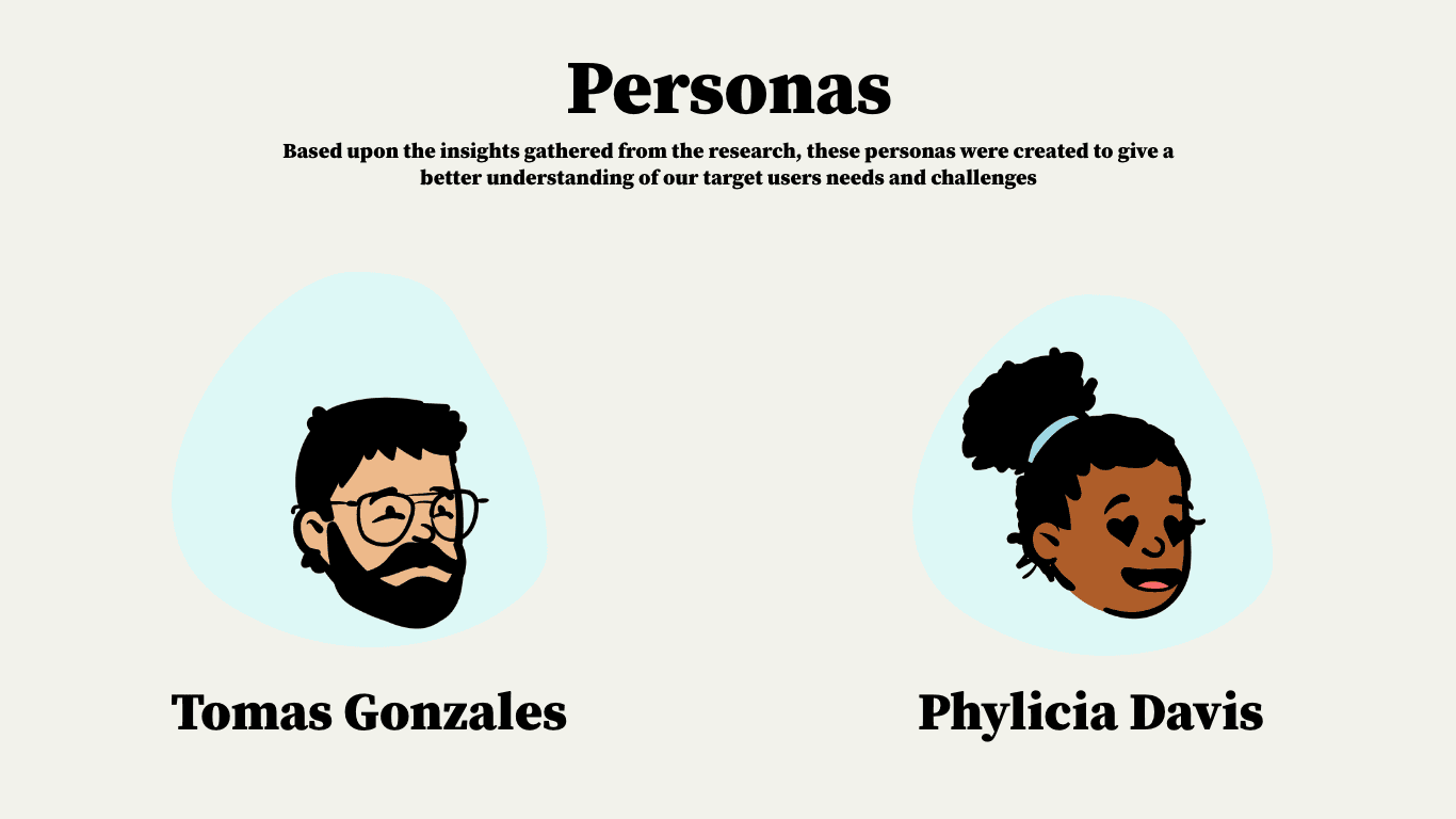
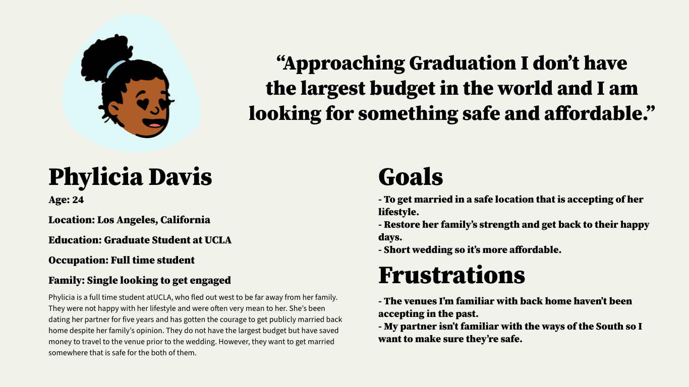
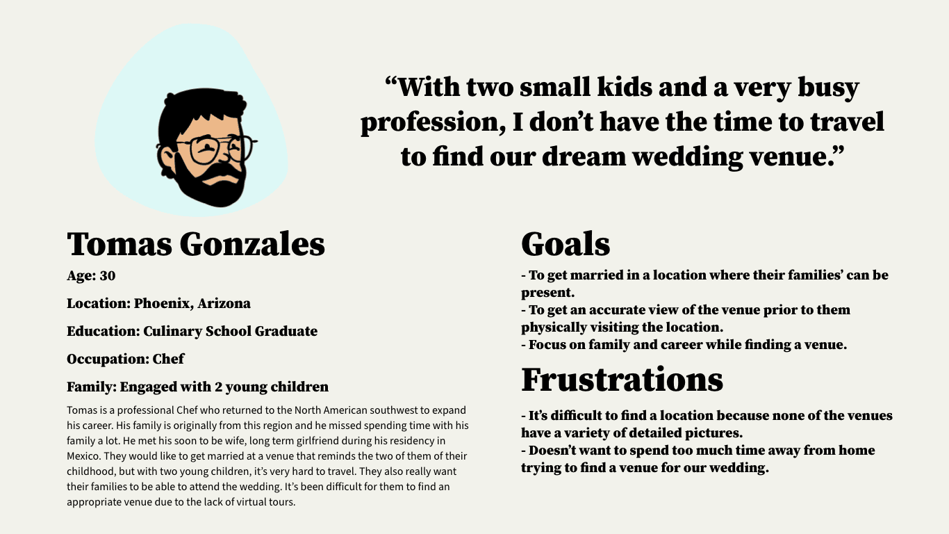
Personas
Based upon the insights gathered from the research, these personas were created to give a better understanding of our target users needs and challenges
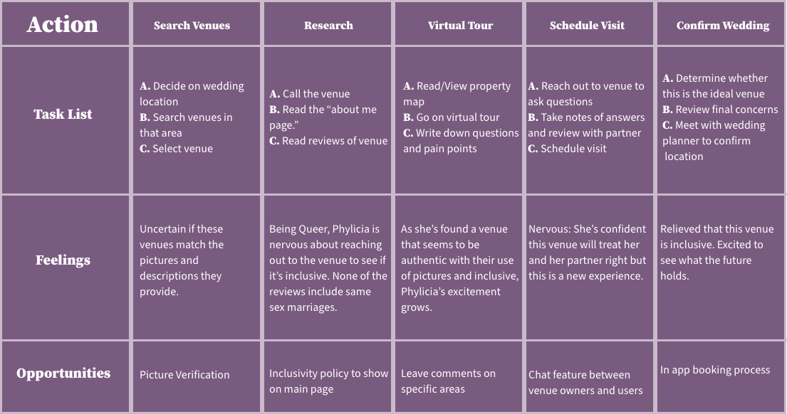
Journey Map - an overview of User flow based on tasks
Design Phase
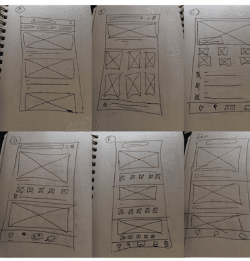
Paper Wireframes
Now that we had an idea of who would be using our app and what their user journey may look like it was time to start brainstorming designs.
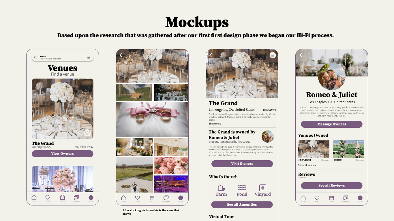
From the insights gained from research, the main features we needed were:
An ability to show verified pictures.
An ability to see how much space a venue has.
A way to communicate with venue owners and learn more about them.
An ability to see what all a venue has to offer.
These paper wireframes show some of my quick iterations that lead to a final wireframe which is shown in the bottom right.
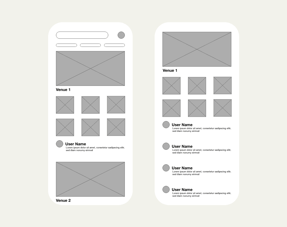
Digital Wireframes
As shown in the paper wireframes our goals were to address insights gained from our research.
Goals for the digital wireframes were to ensure that users had a way to search for venues, a clear way to view verified pictures, a section that allows users to view information about the venue owners and a way to see what all a venue had to offer.
A priority in wire framing was determining how to list as much information about a venue as possible without over crowding a page.
Lo-Fi Prototype
After iterating through wireframes and creating designs based on insights gained from research, this Lo-Fi Prototype was developed.
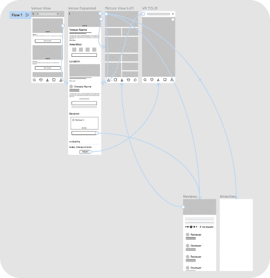
View the Lo-Fi prototype here
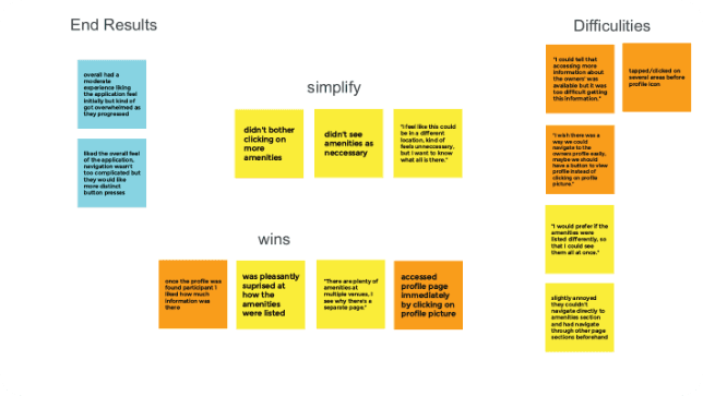
Usability Study
After the first phase of design, a moderated test was held.
This test was conducted with 5 couples all varying in sexual orientation, age and location who spent 30 - 45 min in a moderated session fully navigating through our app. Users were navigated through an intro, list of tasks and a completion questionnaire. Our main focus was discovering what we could learn from the steps users took to find a venue.
The prompts were to:
Scroll & find a desired venue(talk through that process)
Find the amenities that the venue provides
Navigate to the owner’s profile
Review overall experience
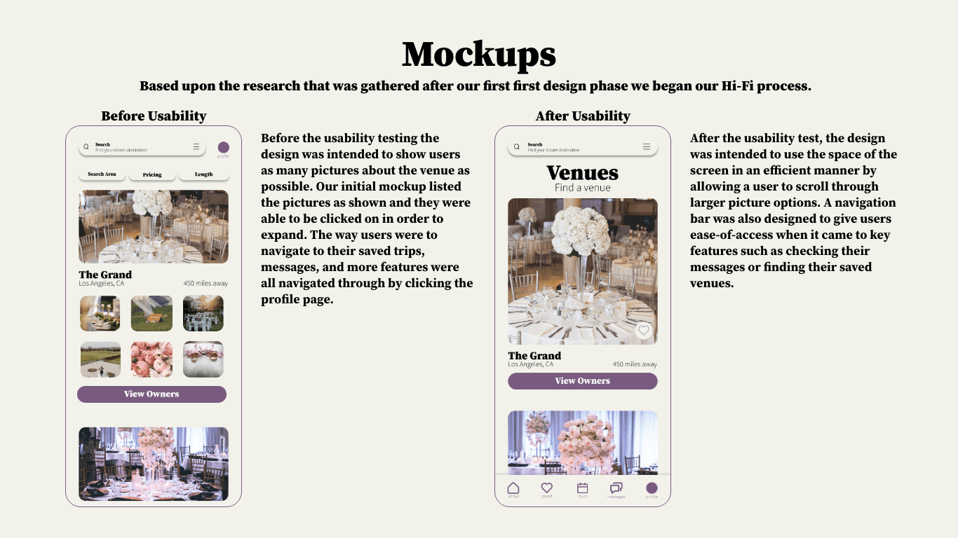
What was learned:
Owner’s profile needs to be more accessible.
Amenities feature needs a better layout to make it more interesting.
There needs to be more distinct buttons throughout the application.
After the initial design phase, another round of designs were created and this what came about:
Second Design Iteration
Accessibility Concerns
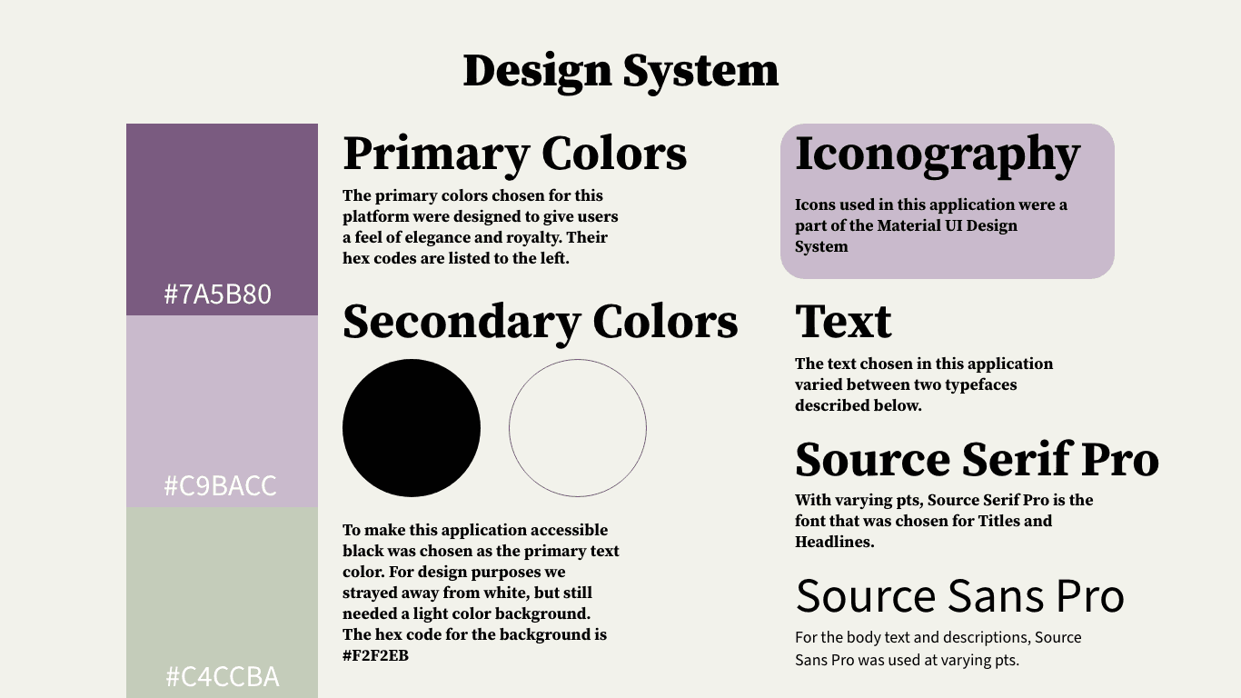
In our second design iteration, I wanted to use more of the purple hue (#C9BACC) from the design system. My goal was to create a visually stunning experience that balanced aesthetics with accessibility.
After further consideration and using "stark accessibility tools" in Figma, I made deliberate choices to ensure legibility and readability. I chose to focus on contrast, using light text on dark backgrounds and dark text on lighter backgrounds that can be seen throughout the application. This strategic approach not only enhanced the visual impact but also prioritized user accessibility.
In our unwavering commitment to inclusivity, I addressed various accessibility concerns. We envisioned a seamless user experience, I explored a grayscale mode, offering an alternative color scheme for users with specific preferences or needs. Moreover, I implemented flexible text sizing options, allowing users to adjust the text size based on their system settings for optimal readability.
By integrating these accessibility considerations into the design framework, I ensured that this UX project would provide an immersive and user-friendly experience for all individuals, regardless of their unique requirements or preferences.
Key Takeaways
Embarking on my inaugural project in the Google UX Design Certificate course, I eagerly embraced the abundant learning opportunities that lay before me. Among the plethora of valuable insights gained, three profound takeaways have left an indelible imprint on my UX design journey.
Firstly, in the realm of accessibility, I discovered the transformative power of the "A11y - Color Contrast Checker" plugin in Figma. Through its guidance, I not only honed my skills in visually enhancing accessibility, but also grasped the pivotal importance of achieving harmony in color composition. Transitioning from the Lo-Fi design phase to the Hi-Fi design phase, I recognized the imperative for seamless navigation, ensuring users are spared the need for guesswork.
Moreover, meticulous efforts were invested in crafting an intuitive user experience, leaving no room for ambiguity or bewilderment. Drawing from my background as a digital artist, I reveled in the freedom to unleash my creativity while relentlessly pursuing clarity and ease of use.
Above all, this project imparted a profound lesson: as a UX designer, my ultimate goal is to curate an experience that effortlessly guides users towards their utmost satisfaction. By harmonizing aesthetics, accessibility, and user-centricity, I strive to unlock the gateway to optimal outcomes.